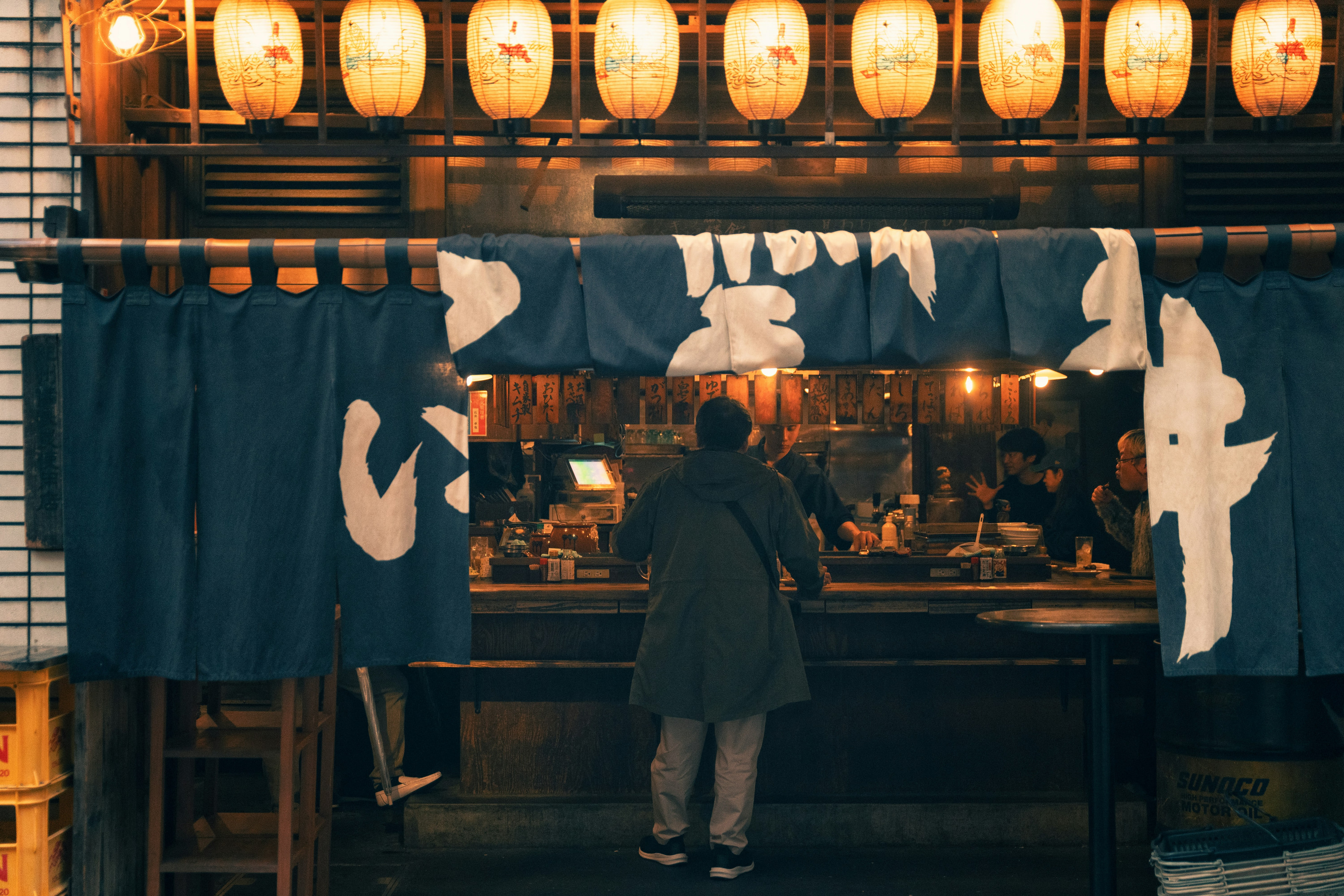
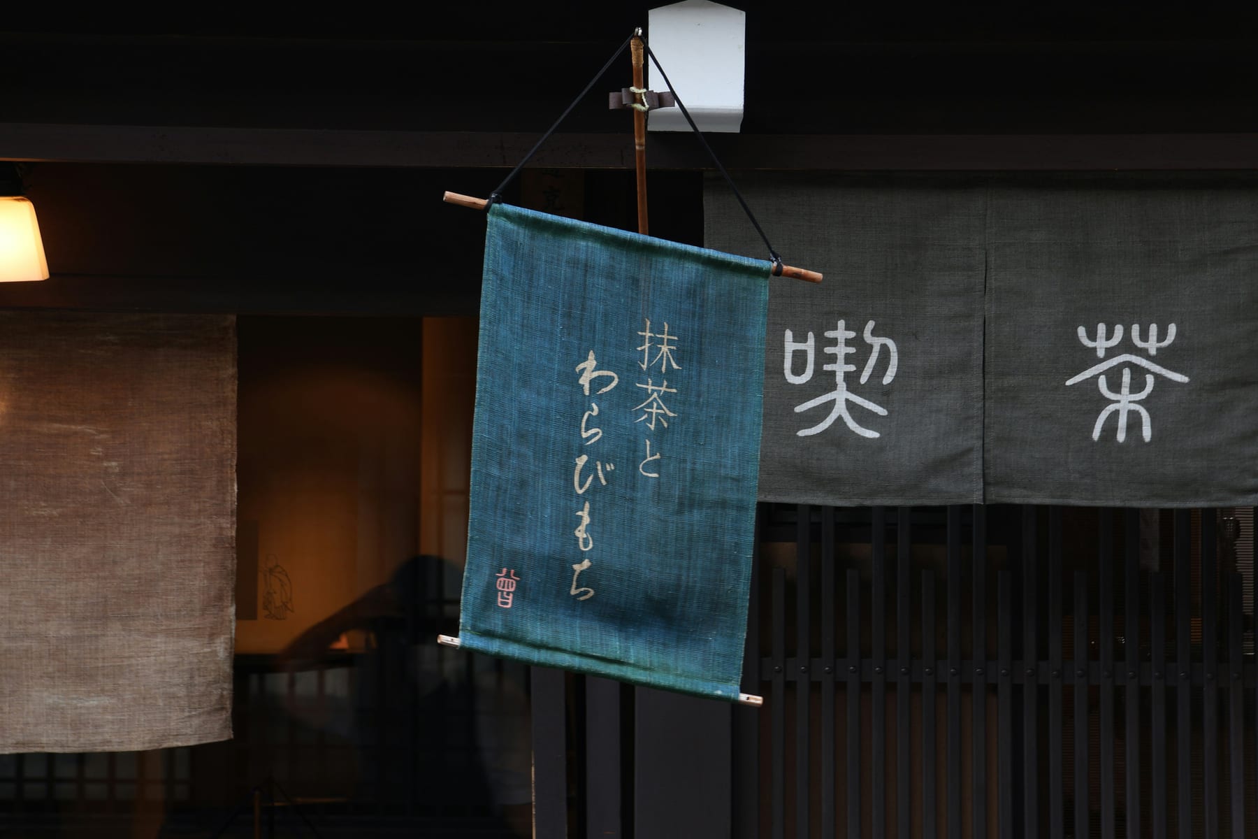
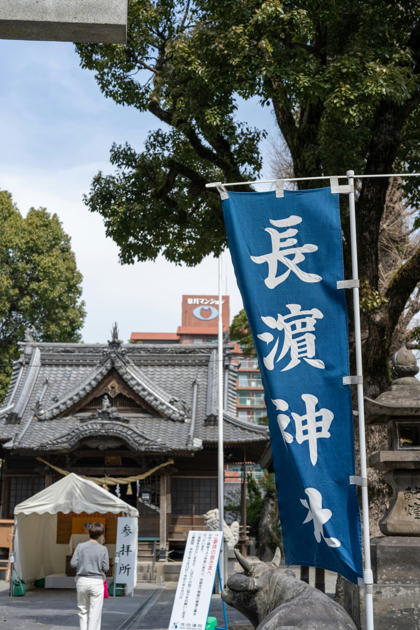
Indigo never stayed in the dye house. It walked out onto the street as shop curtains, signage, and summer cloth — and across those everyday surfaces it carries the full range of the vat, from the palest dip to the near-black of repeated immersion.
INDIGO IS NOT ONE COLOR BUT A SEQUENCE — EACH IMMERSION DEEPENS THE CLOTH BY A NAMED DEGREE.
Hung at a shop entrance, a noren reads as a single blue — but the palette beside it is drawn from the Japanese Color Atlas as a graded family: ai-iro, the indigo of the dye tradition; kon-iro, the deep navy of repeated dipping; and asagi-iro, the pale blue-green of a single light bath. Every swatch links back to its source record.
FROM THE DYE VAT TO THE YUKATA, THE SAME BLUE NAMES RECUR.
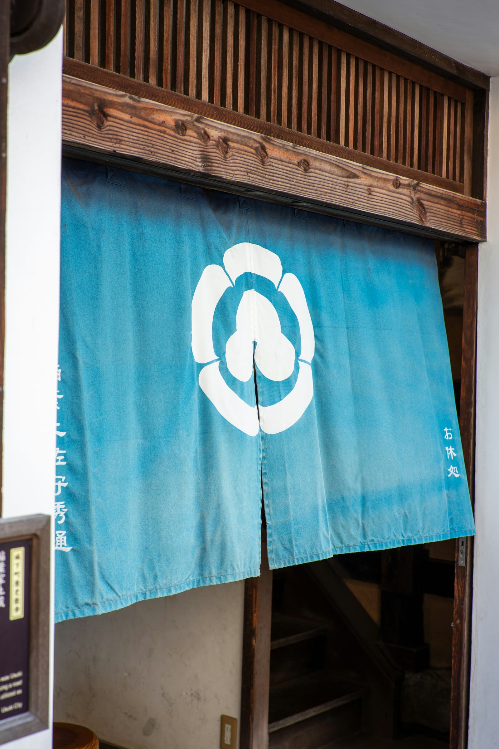
Worn as a yukata or printed with a white family crest by resist-dyeing, indigo cloth keeps the same vocabulary of named blues. The white of the crest is shironeri — refined white — set against the deep ground. A palette is a relationship, not a list.
EACH TONE CARRIES A SOURCE STATUS, NOT A GUESS.
Hex values are screen approximations of historically attested color names — never claimed as exact colorimetry. This is the Chroma Cathay standard: source before style, across every atlas.